Bob Does Sports has built a massive following with over 1 million subscribers—but their logo didn’t quite match the energy. It lacked personality, character, and the chaotic charm that makes their content so entertaining. The goal was simple: design a logo that actually feels like Bob Does Sports—fun, unpredictable, and full of life. Not affiliated with Bob Does Sports.
DESIGN DIRECTION
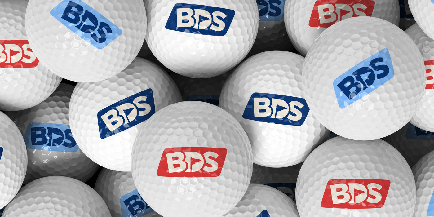
I started with the core: the letters BDS. Tilting them gave the mark an off-kilter, chaotic vibe—like the guys after nine tequila shots. Tightened spacing and subtle cuts improved legibility without losing the personality. Inside the “D,” I carved out a golf flag using negative space—a visual nod to their other brands, Breezy and Have a Day. The mark lives inside a bounding box to add structure and energy.
Then came the wordmark: same unfiltered attitude, just more fleshed out—kind of like Fat Perez. The final design is sharp, loud, and playful. Nothing polished or pretentious—just like the crew shanking balls and having the time of their lives.