LIT
BRIEF
LIT is a vibrant business that crafts custom-made LED lights to funk up your space. Their old branding was dim which was a stark contrast to their cool products so they needed updated branding to match them.
DESIGN DIRECTION
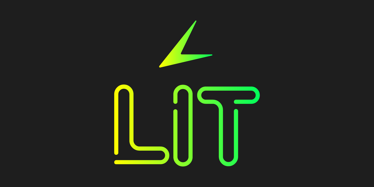
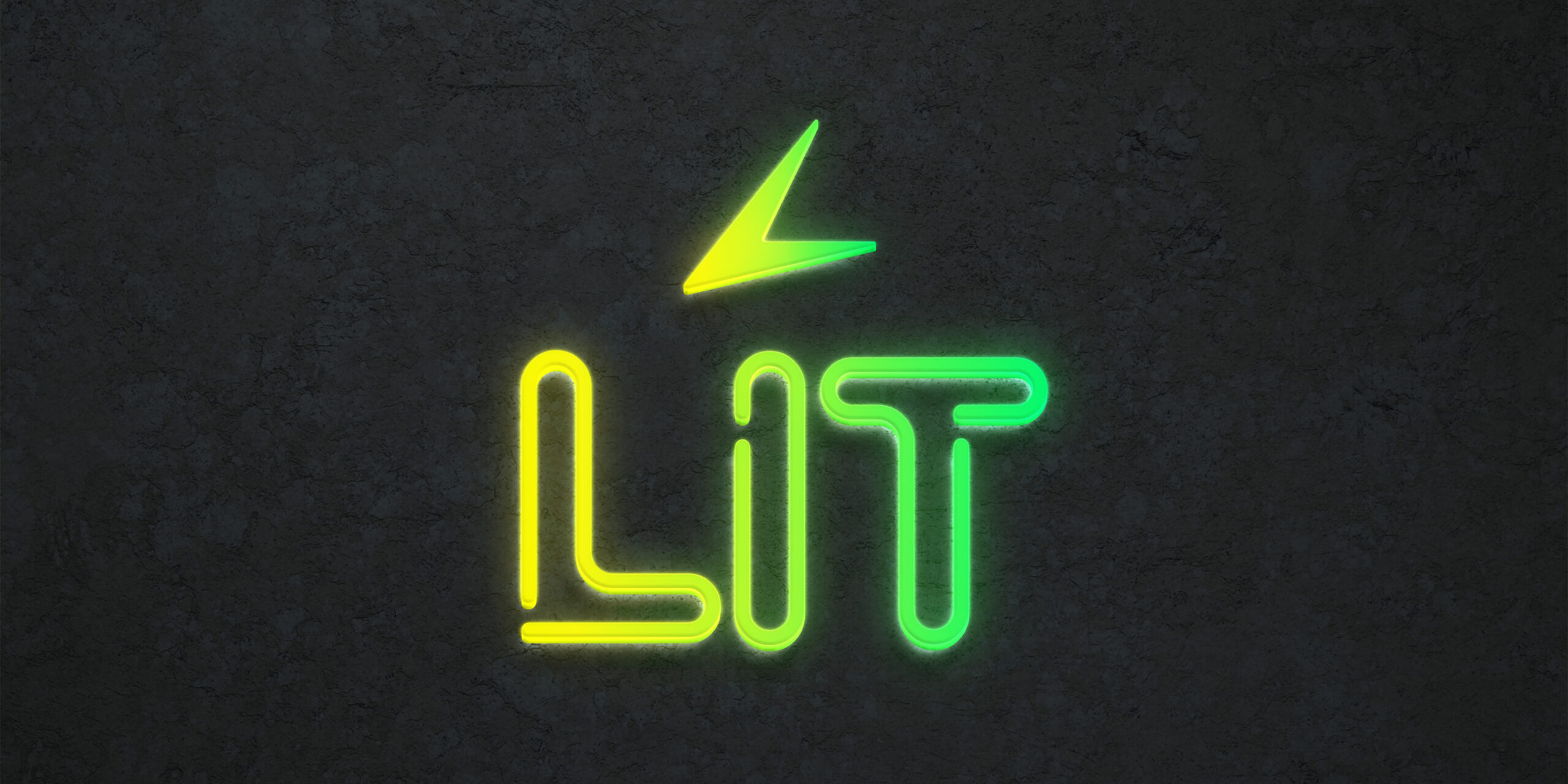
The goal of this logo creation was to produce a vibrant logo that stands out. Using a gradient of yellow and green gives it an electric feel to match the look of LED lights. The notches in the type give it a sense of strung up lights which also matches the products LIT sells. For the logo mark, I created an abstract “L” from the top half of a lightning bolt shape to again match the electric feel of the brand.
