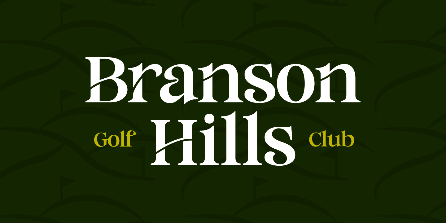
Branson Hills had an outdated logo that didn’t reflect the quality of the course. I set out to redesign it with a look that better represents the caliber and character of the experience they offer.
DESIGN DIRECTION
The goal of this logo was to create a bold design that reflects the rolling hills Branson is known for. The strong typography, paired with subtle cuts in the letters, shapes the landscape within the logo and adds a unique sense of personality.