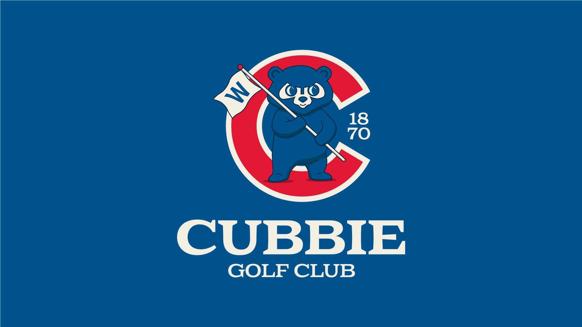
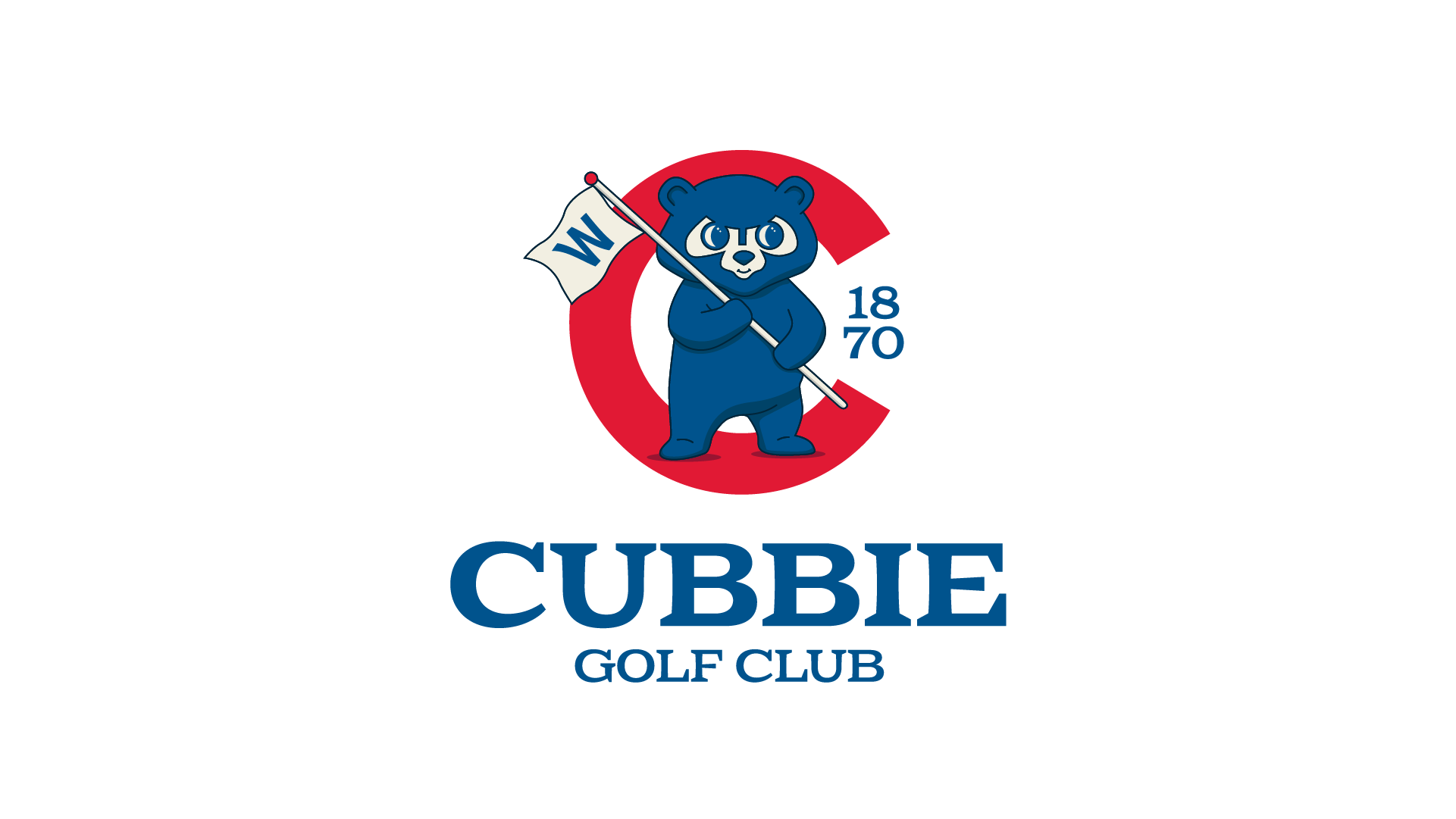
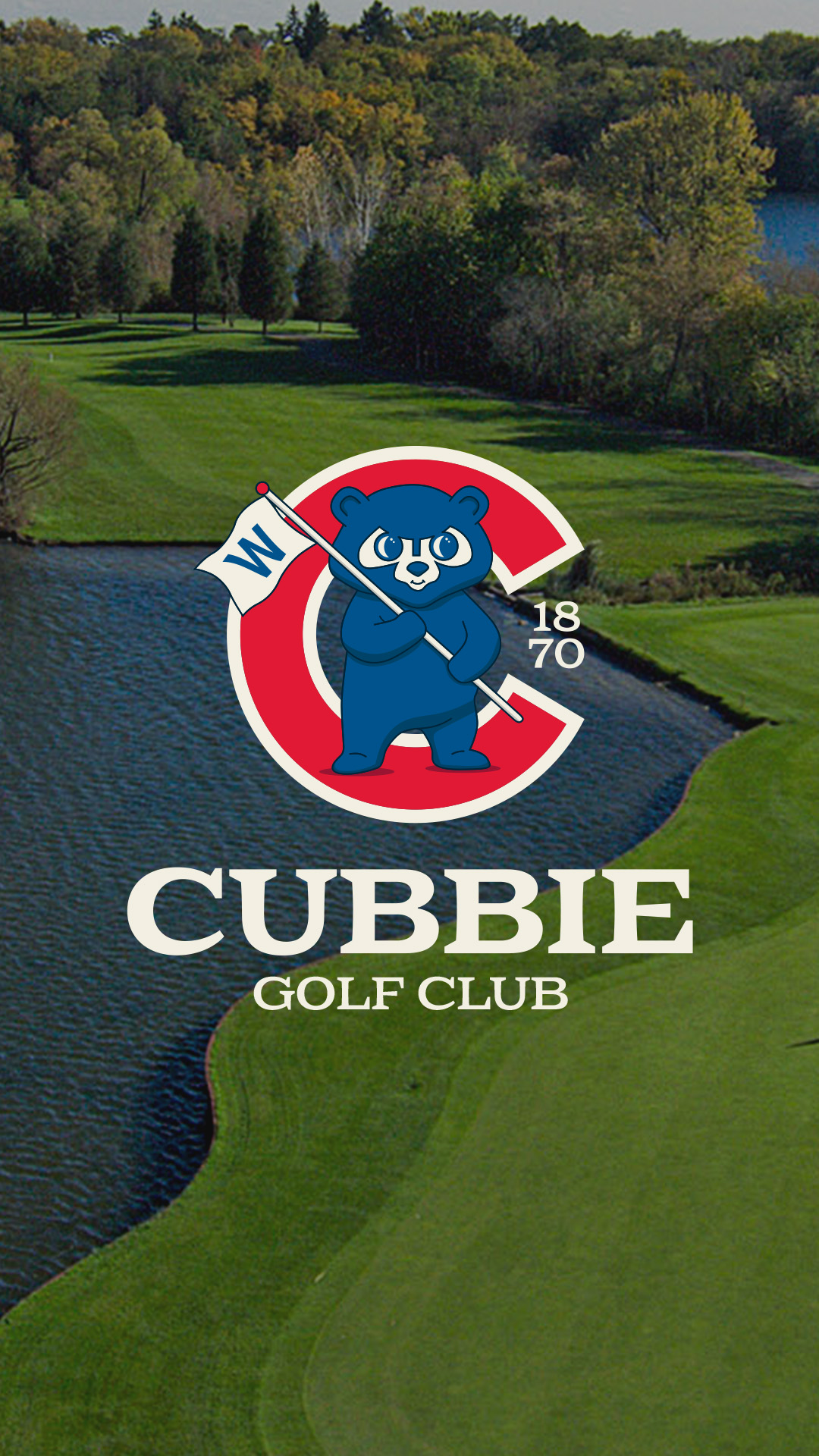
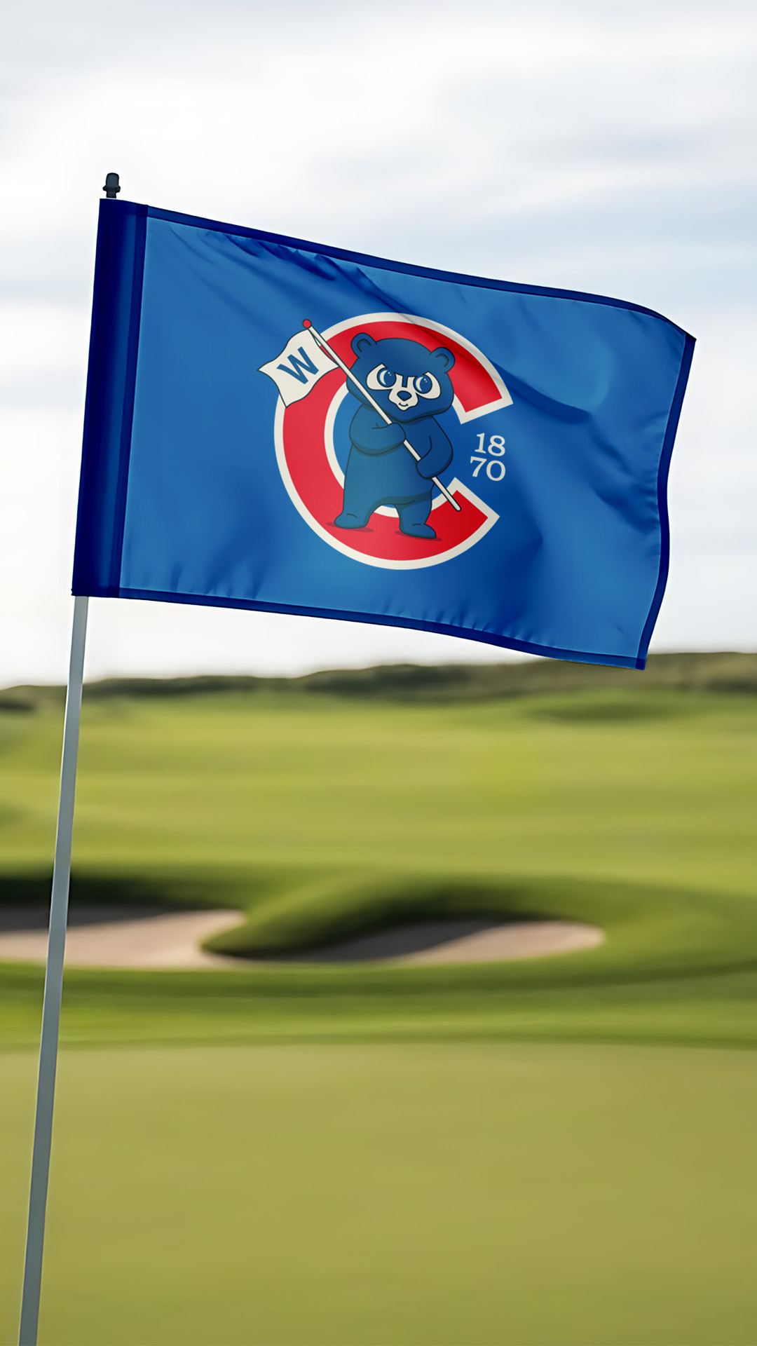
This was a concept project imagining what the Chicago Cubs’ identity could look like if they had their own golf course. The goal was to merge the Cubs’ deep history and recognizable brand elements with traditional golf club aesthetics to create something that felt authentic to both worlds.
DESIGN DIRECTION
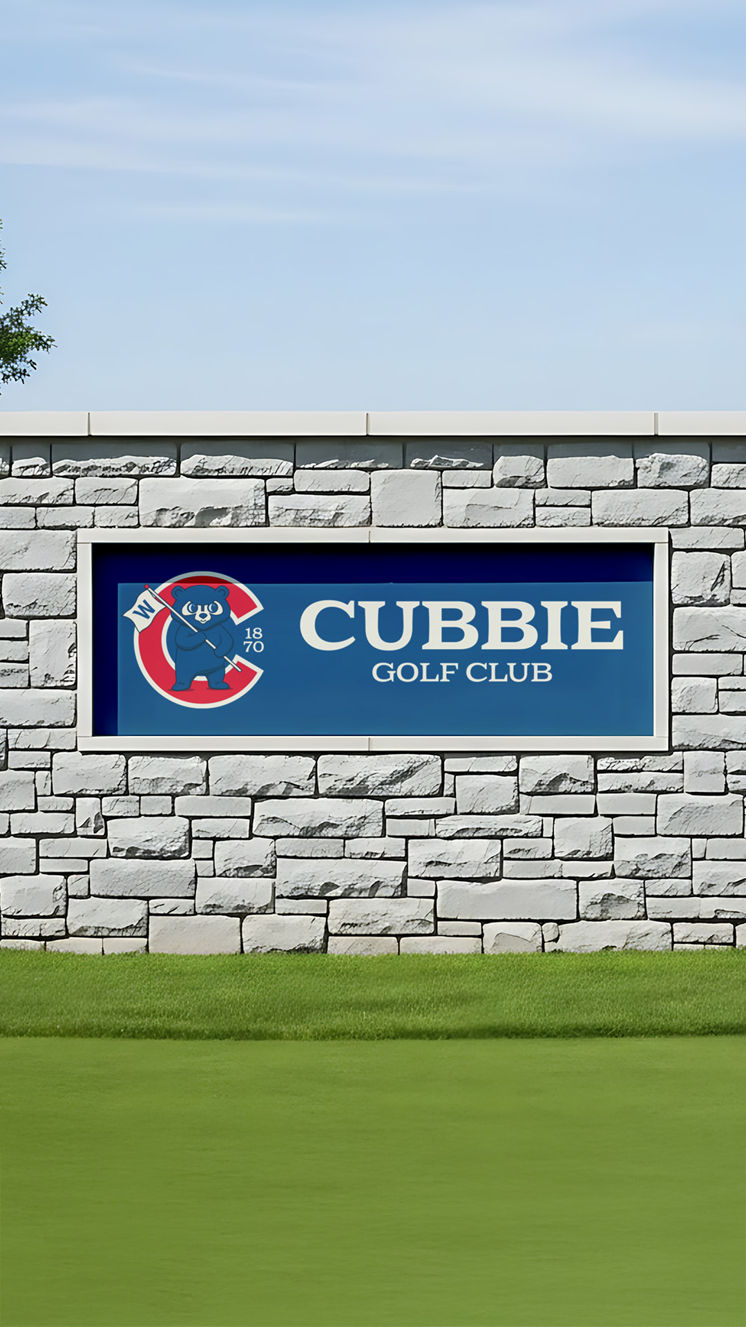
With such a historic franchise, I intentionally pulled from multiple eras of Cubs branding. I started with one of their classic logos featuring the cub head and expanded it—illustrating a full body to bring more personality and motion to the mark.
To integrate golf naturally, I placed a flag in the cub’s arms. The flag features the iconic “W,” referencing the tradition of Cubs fans flying the W after every win. Behind the cub, I layered in the famous red C to anchor the design in the team’s primary identity.
To reinforce the traditional golf club feel, I incorporated the franchise’s founding year, 1870, into the negative space—adding a heritage detail often seen in established course marks.